Native Campervans – Brand Refresh
Client:
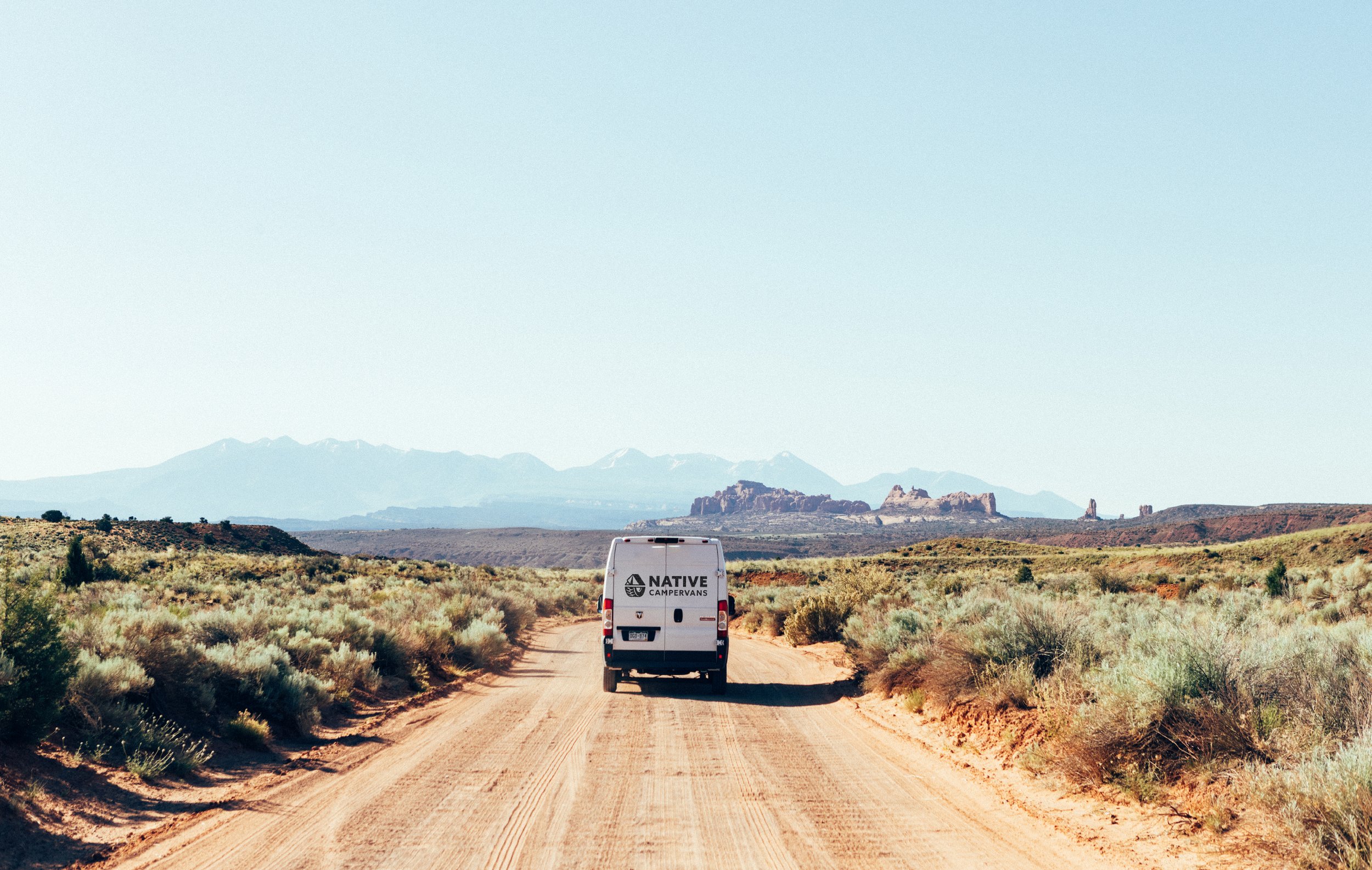
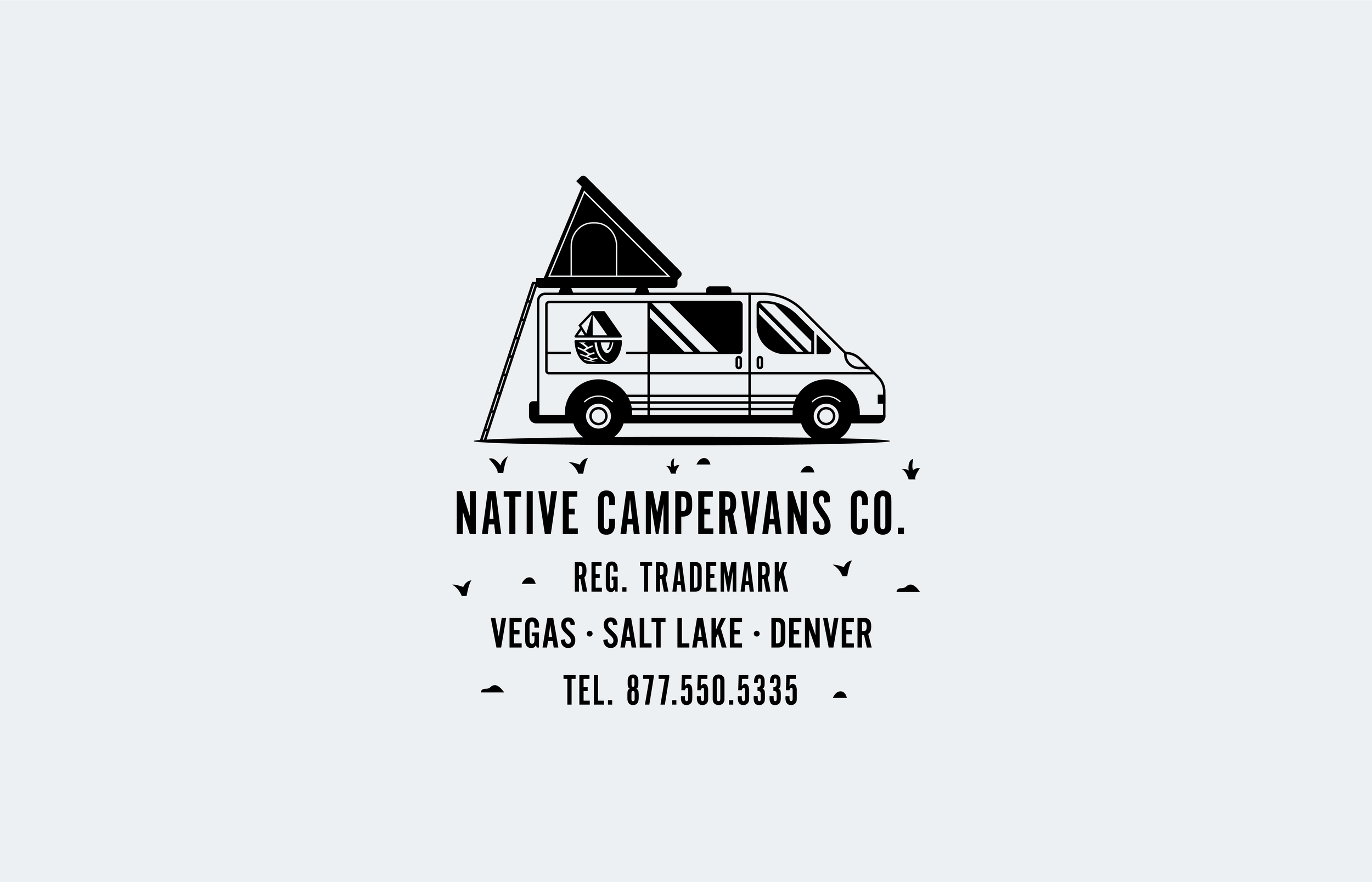
Native Campervans
Services:
Brand Refresh, Style Guide, Apparel
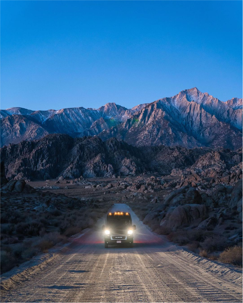
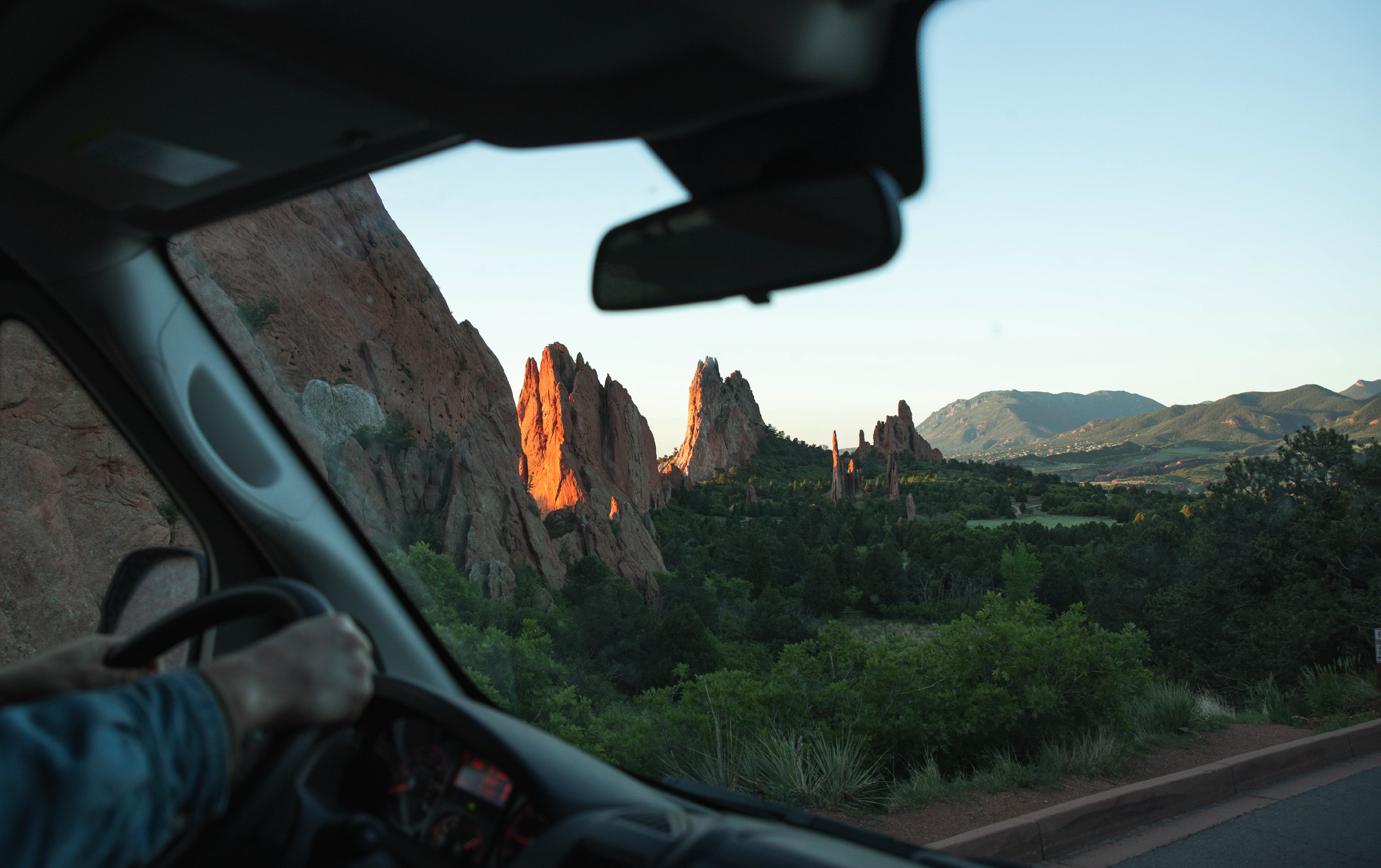
Locations: Denver, Salt Lake City, Las Vegas, Phoenix
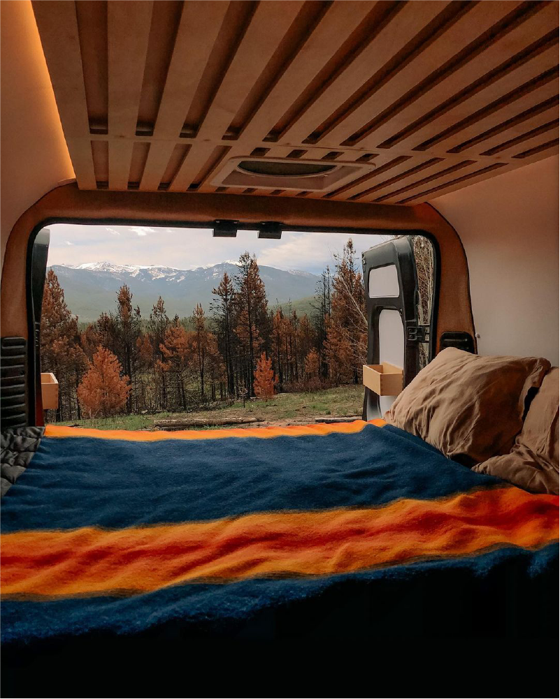
VanCamp Design Co. was approached by Native Campervans with a comprehensive request for a brand refresh. The team at Native enlisted our expertise to elevate their brand symbol, establish consistency in typography, create a harmonious color palette, and expand their collection of secondary brand materials to strengthen their merchandise, apparel giveaways, and sales.
Symbol
From the very beginning we knew that Native's symbol was in need of a thorough makeover. While undeniably iconic, the original symbol suffered from excessive complexity and failed to maintain its impact when displayed at a smaller scale.
In order to modernize and elevate the symbol we skillfully achieved a harmonious equilibrium between dark and light regions, streamlined the treads by reducing their intricacy by ~fifty percent, incorporated a subtle shine effect on the tire for added depth, rectified the lighting inconsistencies, and achieved a sense of unity by enhancing and enlarging the stroke width.

BEFORE & AFTER


“We engaged VanCamp Design Co. to conduct a brand refresh that was more consistent with the overall theme and direction of our company. Zach proved to be instrumental through his creativity, attention to detail, and efficiency. He has great intuition and a clear communication style, making the process seamless. He over-delivered in the final product and gave us a number of assets that we can use for different applications - hats, shirts, stickers, marketing material, etc. I highly recommend VanCamp Design Co. and will be using them again in the future.”
– Dillon Hansen | Co-Founder & Head of Brand, Native Campervans